Logos are often the very first impression people have of a brand. A great logo can spark recognition, build trust, and help a business stand out in a crowded marketplace. But what actually makes a good logo?
For beginners, the process can feel overwhelming – colors, fonts, shapes, and style all come into play. The truth is, you don’t need to be a professional designer to understand the core principles of strong logo design. With the right guidance, you can create a logo that looks polished, professional, and perfectly aligned with your brand.
This guide breaks down logo design into simple, step-by-step concepts. Each section focuses on one principle, with easy tips to help you avoid common mistakes and start off strong.
Step 1: Keep It Simple
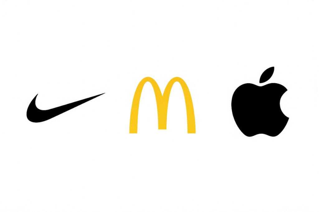
Simplicity is the foundation of any great logo. Think about logos you instantly recognize: Apple’s bitten apple, McDonald’s golden arches, or Nike’s swoosh.
Each is extremely simple, yet powerful.
Why simplicity works:
- Easy to remember
- Works in different sizes and formats
- Avoids clutter that can confuse or overwhelm viewers
Beginner tip: Resist the urge to add too many details. Stick to one symbol, one wordmark, or one clean concept. Simplicity ensures that your logo communicates your brand in the quickest and most effective way possible.
Step 2: Use Color Psychology
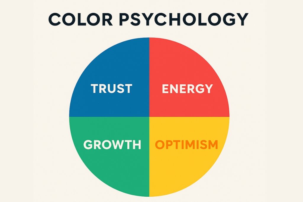
Colors aren’t just decoration – they carry emotion and meaning. Blue often signals trust and professionalism, red can evoke passion and energy, while green is tied to growth and health. Choosing the right colors can connect your logo to your brand values in a powerful way.
When selecting logo colors, consider how they make your audience feel. Ask: Does this color reflect what the brand stands for?
See Our Full Color Psychology BreakdownBeginner tip: Stick to two or three main colors at most when making your logo. A crowded palette can make your logo look unprofessional.
Step 3: Choose the Right Typography
Typography is more than just picking a font. The style of your text communicates tone and personality.
A serif font (with small “feet” at the ends of letters) can look classic and trustworthy, while sans-serif fonts appear modern and clean.
Handwritten or script fonts can feel personal and creative, but they must be legible at all sizes.
Guidelines to follow:
- Keep readability as the top priority
- Don’t mix more than two fonts in one logo
- Ensure the typeface matches the brand’s voice
Example: A luxury jewelry brand might use an elegant serif font, while a tech startup may lean toward a sleek sans-serif.
Don’t Forget to Protect Your Logo With CopyrightingStep 4: Ensure Versatility
A good logo works anywhere. It should look just as sharp on a website, in your Google Business Profile, on business cards, billboards, or even small social media icons.
Versatility checklist:
- Test your logo in black and white
- Make sure it scales without losing detail
- Check how it looks on different backgrounds
This adaptability ensures your logo grows with your business and stays consistent across all channels.
Step 5: Make It Relevant to the Brand
Your logo isn’t just art – it’s a visual identity that tells people who you are and what you do. Relevance is crucial. A playful, colorful logo might be perfect for a children’s toy shop, but not for a law firm.
Ask yourself:
- Does this symbol or font reflect the brand’s values?
- Will my audience understand what my business is about?
If the logo design doesn’t align with the business identity, it won’t resonate, no matter how polished it looks.
Common Mistakes Beginners Should Avoid
Even with the best intentions, beginners often fall into the same traps.
Watch out for these pitfalls that can weaken your design:
- Cluttered visuals – trying to add too many icons, shapes, or layers that compete for attention
- Overly trendy choices – fonts or styles that look fresh now but may feel dated in a year
- Poor font pairing – mixing mismatched typefaces that clash instead of complementing each other
- Inconsistent branding – using mismatched colors, fonts, or styles, can weaken trust and confuse your audience
By focusing on clarity and cohesion instead of chasing trends, you’ll create a design that feels timeless and professional.
Future-Proof Your Logo
A logo isn’t just for today – it needs to grow with your business. Future-proofing means thinking about where your brand will appear years from now, especially in the digital space.
- Optimize for digital icons – your logo should remain recognizable even when reduced to a tiny app icon or website favicon
- Plan for multi-platform use – test how it appears across business listings, social media profiles, mobile apps, and printed materials
- Prepare for different formats – design both horizontal and stacked versions so it adapts to different layouts
- Keep it scalable – ensure the design keeps its integrity whether on merchandise, signage, or packaging
Future-proofing is about anticipating how your brand will evolve and making sure your logo can adapt without losing its identity.
The Easy Button: AI Tools for Logo Creation
If you’re already intimidated by reading this and trying to wrap your head around designing a logo, don’t be. There are AI tools out there that make the process faster and more approachable.
Typically all it requires is knowing your brand name, slogan, general color scheme, and font preferences and you can whip up logo examples quickly and painlessly.
These serve to give you a good starting point, especially if you aren’t clear on what you want your logo to look like.
Note the elements that you like from the different examples and begin to put together the logo that best suits your business and preference.
Best AI Logo Generators for BeginnersDesigning Your Perfect Logo
A strong logo doesn’t need to be complicated. By focusing on simplicity, color psychology, typography, versatility, and brand relevance, beginners can create designs that leave a lasting impression.
Avoid the common pitfalls of clutter, mismatched fonts, or random colors, and instead build a logo that feels cohesive and purposeful.
As your brand grows, remember to future-proof your logo so it works across digital platforms, social media, and print. This way, your visual identity will stay consistent and recognizable wherever it appears.
With these principles, you’ll have a solid foundation for designing a logo that captures your brand’s story – whether you create it yourself or use modern design tools for extra support.
Frequently Asked Questions
An effective logo is simple, memorable, versatile, and relevant to the brand. It should clearly represent the business while being easy to recognize.
Most logos work best with two to three main colors. This balance keeps the design clean and ensures the logo stays versatile across platforms.
Yes. By focusing on the basics – simplicity, color psychology, typography, versatility, and relevance – beginners can design logos that look polished and professional.
A versatile logo works everywhere: websites, social media, print, or even merchandise. It maintains brand consistency whether displayed small or large.
Yes, copyrighting your logo protects it as intellectual property.